Case study
Goodreads Redesign.
Rethinking how readers track and discover books — a focused redesign exercise.
- Year
- 2024
- Type
- App redesign
- Role
- Solo redesign
- Timeline
- 3 weeks
- Tools
- Figma
The problem
Goodreads is loved for community but cluttered for everyday flows.
The outcome
Practiced restraint — knowing what NOT to change.
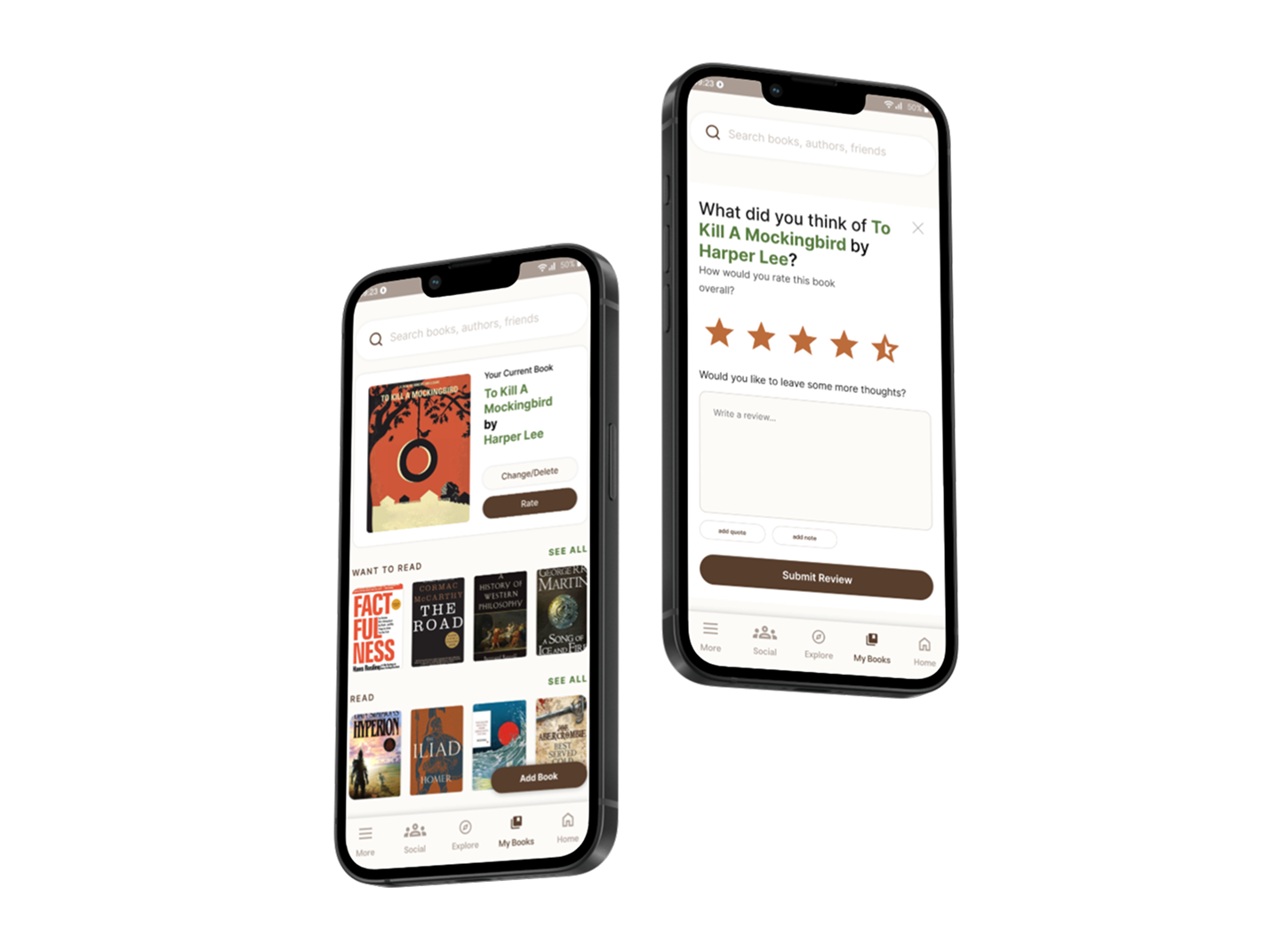
Highlights
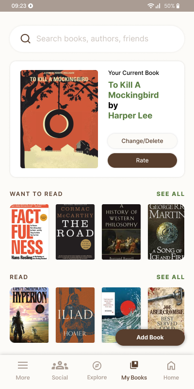
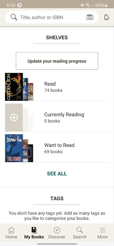
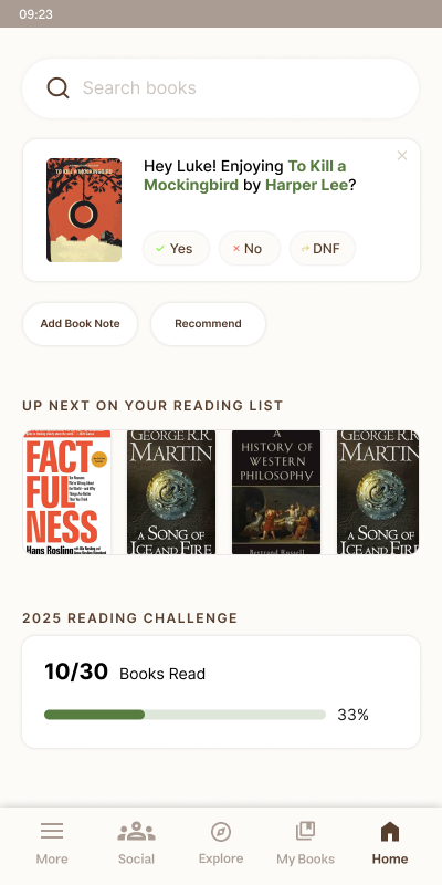
My Books — current read leads, FAB to add
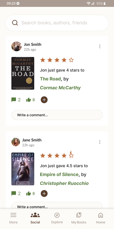
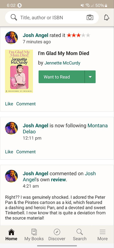
Social — like and comment inline
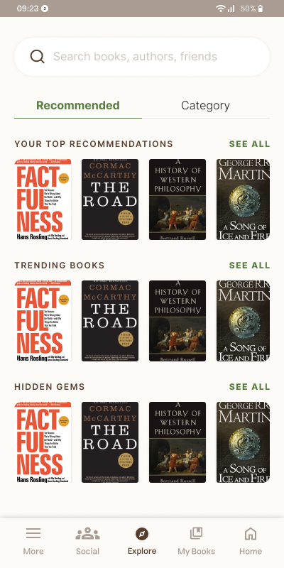
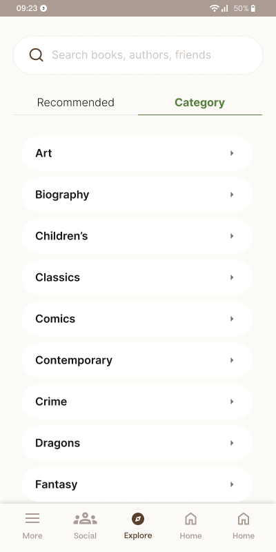
Explore — recommendations and categories
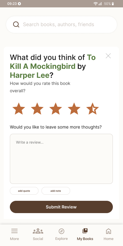
Review — half stars, quotes, notes
The problem.
Goodreads is a beloved product because of its community — reviews, ratings, friend activity. But the core 'add a book, track progress, discover next' flows feel buried under a decade of feature accretion. The brief: respect what makes it loved, but make the everyday flows easier.
The approach.
Step 01
Listening to long-time users.
Goodreads is loved, but tolerated.
Pulled real reviews and forum threads to map what current users love and what they put up with. The community kept surfacing as the thing people stay for; the everyday flows kept surfacing as the thing they tolerate.
Users find that
- Weird navigation
- Not enough customizability — custom lists
- Important tags are missing or not highlighted
- Not enough insight into your reading habits
- Things like quotes are not displayed well
- Only discrete 1–5 ratings — no half stars
- Home screen too cluttered with irrelevant content
Step 02
What people are trying to do.
Track, discover, review — the unglamorous core.
Mapped what users were trying to do and where they stalled. Tracking books, discovering new ones, and writing reviews dominated the list. Those flows became the targets.
As a user I want to
- Track the books that I have read
- Review and rate the books that I have read
- Read reviews from other people
- Prioritize reviews from friends
- Discover new books I might want to read
- Add and manage a want-to-read list
Step 03
Where to focus, where to leave alone.
Constraint, not reinvention.
Community surfaces stay mostly intact. My Books, Social, Explore, and Review get rebuilt from the user's task — not the existing IA. Half-star ratings, a FAB to add a book, the current read promoted, inline social interactions, and notes-with-quotes on reviews — each tied to a specific pain. I also experimented with the nav itself: the most-used pages live on the right of the bar instead of the left, so the thumb has the shortest path to the things people actually do.
“The hardest part of a redesign is what NOT to change.”
The solution.
The outcome.
An exercise in designing within constraints rather than against them. Goodreads' community is its real product — design choices that ignored that got rejected by my own gut before they were worth testing. The everyday flows, by contrast, had room to move: every change tied back to a specific pain point users had already articulated.
What I’d do differently
I'd run real-user tests with longtime Goodreads users to validate that the IA shifts didn't disorient them — and pressure-test the half-star rating decision, since some readers may have built a personal scoring rhythm around the existing five whole stars.
Next case study