Case study
J Lorin.
Immersive artist showcase — large imagery, soft typography, motion that guides.
2025 · Website · Solo, end-to-end · A couple of weeks · Figma · Framer
See it live
jlorin.com
The problem
Artist sites either bury the work in chrome or strip it bare.
The outcome
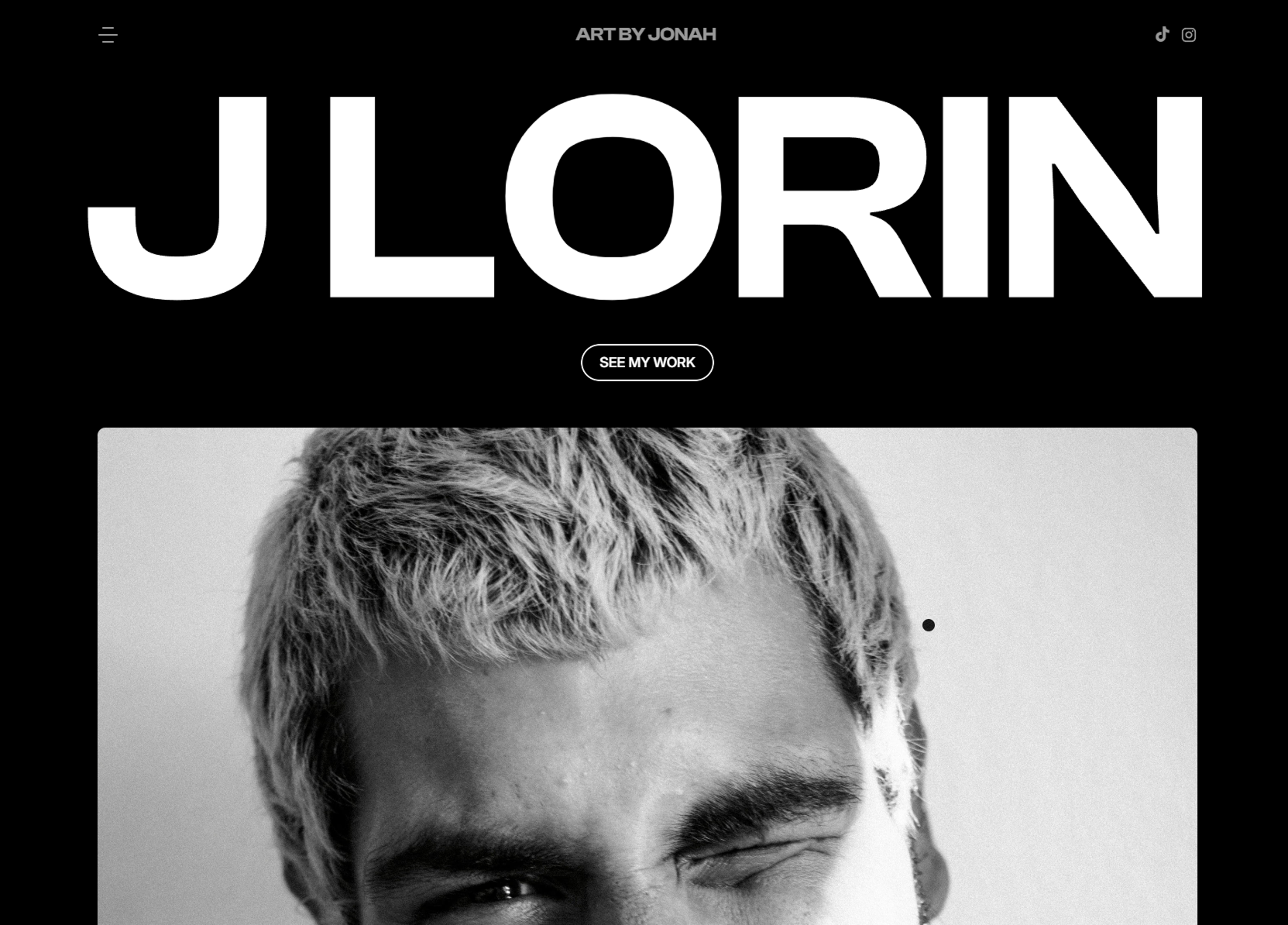
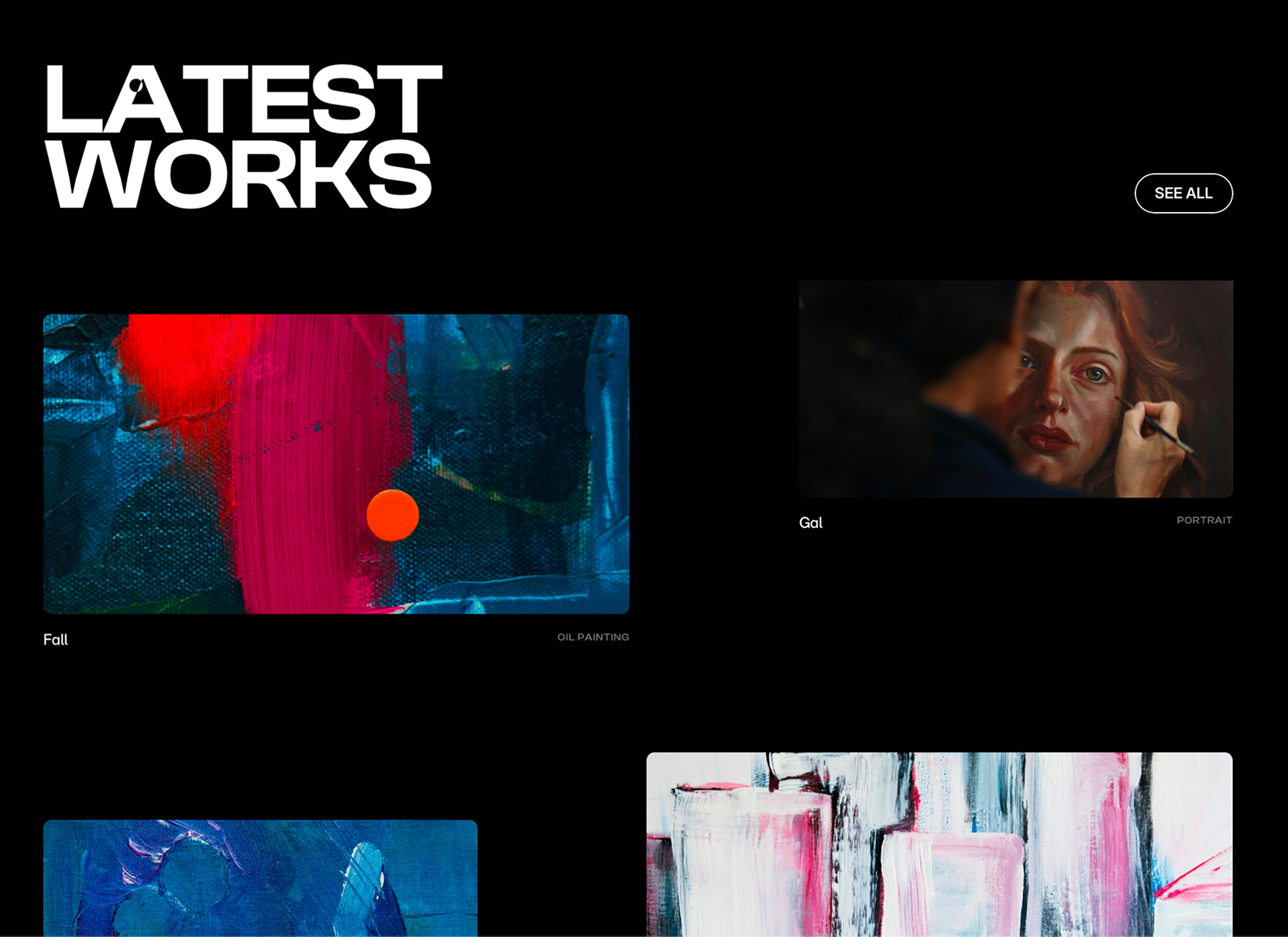
Live: an image-led site that lets the work breathe.
The problem.
Many artist websites struggle to balance aesthetics with usability — either feeling cluttered or so minimal they fail to communicate identity. The brief: design an experience that highlights the artist's visual work while keeping the navigation clear and the emotional register intact.
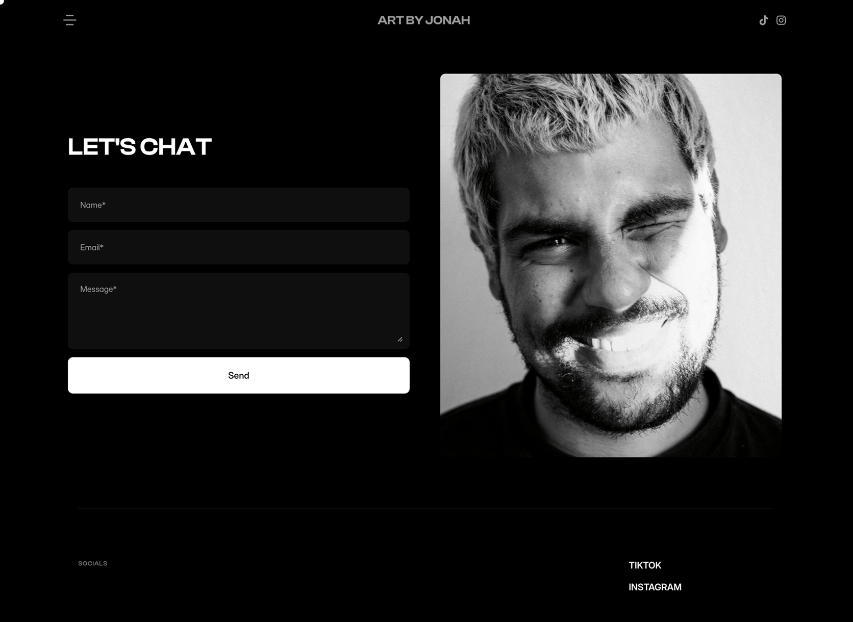
Built a calm, image-led experience in Framer — oversized visuals, subtle motion, generous white space. A responsive, scroll-first flow guides visitors naturally. Soft typography and a restrained monochrome palette, with modern animation and cursor details, add character without noise.
The outcome.
Shipped a live concept site where the artwork is the loudest thing on every page. The interface is the picture frame, not the picture — exactly the brief.
What I’d do differently
Fictional content made every taste call easier than reality. I'd love to test the same process with a real artist's actual work and voice — a real identity brief sharpens the trade-offs.
Next case study